How to make the logo design process less daunting

“Designing a logo is the most difficult task a graphic designer is asked to do,” says Bob Sprecher, McGuffin’s chief creative officer, who himself is an experienced graphic designer and illustrator.
“Boiling down a company’s essence — distilling it down to a few graphic elements—takes extreme skill, and the process can be soul crushing.
“You can design a brochure or an ad in a vacuum, but not a logo. There’s usually a committee involved in the review, and a logo is a very personal thing with people. Everyone has a different opinion and wants to weigh in,” he explains.
Avoiding a logo misfire
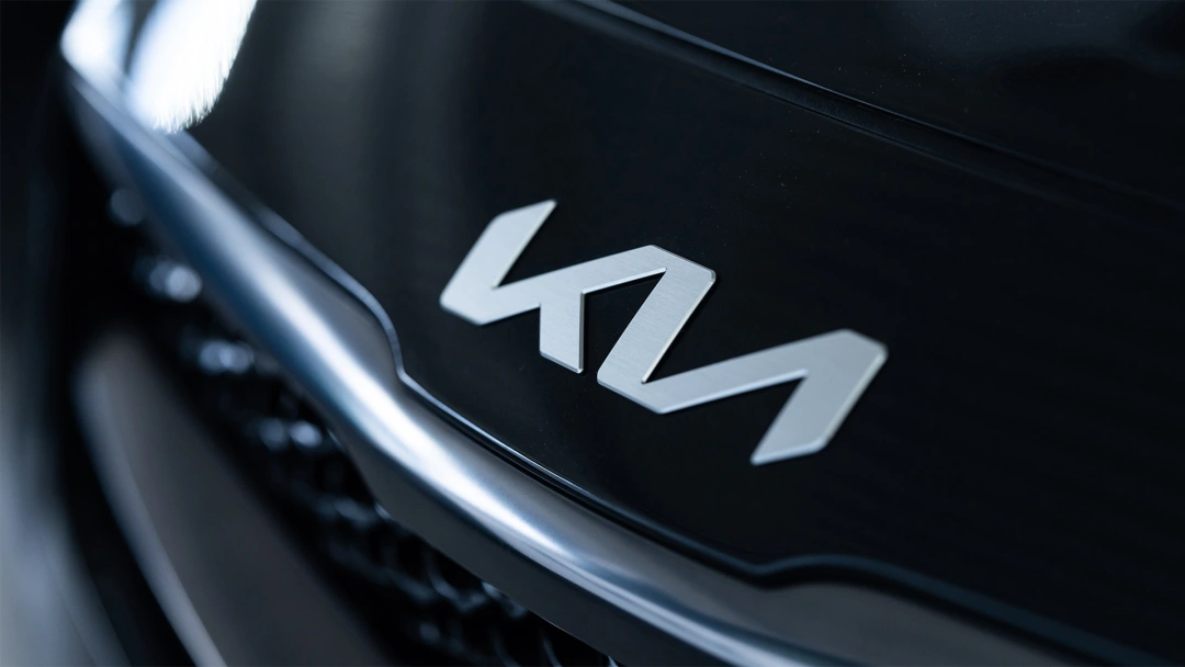
To demonstrate how critical a logo design can be to the success of a company, let’s revisit a recent brand redesign that was met with considerable controversy. In January 2021, the car company Kia redesigned their logo and unleashed a groundswell of criticism and confusion. To quote Inc Magazine:
With its trendy, angular font, the stylized version resembled a space-age type signature. The K in Kia was clear. But regrettably, the IA looked more like an N. It even led to a spike in Google searches: “What is the new KN car brand”? The rationale from the company was that the new logo represented its commitment to innovation and its ambitions to become a leader in the automotive industry.
Inc. believes the redesigned Kia logo failed because it violates four basic principles of brand design:
- Lack of clarity – The abstract and asymmetrical shape can be interpreted as “KN,” making it more difficult for people to recognize and therefore remember the logo.
- Inconsistency with brand history – The new logo is a significant departure from the previous one, which was well-established and recognizable.
- Difficulty in reproducing – The new logo design is intricate, with complex lines and curves that can be difficult to reproduce in smaller sizes.
- Overly complex – The redesigned logo has multiple layers and intricate details that can be distracting and confusing to customers.
Creating a successful brand mark
Here are some valuable tips our designers have learned over the years that will make the process a little easier:
- Try a variety of options – Do lots of sketches and explore many different directions.
- Collaboration is key – Share your sketches and ideas among your fellow designers. Have several people in on the creative process.
- Keep it simple – The most effective logos have clean, simple design elements that quickly convey a brand’s identity. It’s best to avoid overdesigning.
- Make it versatile – The logo should be adaptable to a variety of mediums and sizes. It should look good in both black and white and in color, and it should be scalable to any size without losing its impact.
- Shape is a powerful communicator – A study in the Journal of Consumer Research revealed that the circularity or angularity of a logo is powerful enough to affect consumers’ perceptions of the attributes of a company or product.
- Work small, in thumbnails – This forces you to look at the logo design the way most consumers will end up seeing it: on packaging, promotional materials, website headers, etc.
- Avoid the latest design trends – They become out of date. The last thing a company wants to have to do is change their logo after only a few years. This creates confusion in the marketplace. The best logos are timeless. They can be updated and refreshed over time, with slight and simple adjustments that the average customer won’t even detect.
Finishing strong
Above all, try not to get frustrated. Logo design can be a long, drawn-out process, with lots of iterations. Stay mentally tough through the process. Though the journey can be arduous, creating a great logo — one that stands the test of time — is a rewarding experience.