Navigating the tricky world of stock photography

One of the most captivating elements of design is photography. It has the power to draw the eye in and tell a narrative in an instant. But what happens when your project demands compelling visuals, yet budget, time or resources make custom photoshoots a challenge? That’s where the strategic use of stock photography comes into play.
Think of high-quality stock photos as valuable assets in your design toolkit that can amplify your brand storytelling. Stock photo platforms provide businesses with a convenient solution, offering visuals that work for a brand’s website or marketing campaign while also meeting budget and time constraints.
For anyone who has worked in marketing and/or design, I’m sure you’re all too familiar with the hours spent searching the web in pursuit of the “perfect” photo for your social media post or digital ad. As a senior designer at McGuffin, I’m here to provide some tips and tricks that can help you streamline your search and consistently discover visuals that resonate with your brand and objectives.
1. Laying the groundwork: understanding your visual needs
Before beginning the image selection process, first familiarize yourself with your brand guidelines and campaign narrative. What is the core story you aim to communicate visually? Who are you trying to reach? Do you have specific guidance on the type of imagery to use?
For example, say you need to update print materials for an investment firm. The firm wants to showcase how it can be trusted to grow the wealth of its clients. While an initial marketing concept might feature a standard client-advisor interaction, a more thoughtful approach could instead use lifestyle shots. This approach would portray clients enjoying the benefits of their financial security, implying that their success has been a direct result of the firm’s guidance and expertise.


2. Avoid clutter
As you continue your search, it’s important to be mindful of the visual clutter within your chosen photographs. While a completely empty background isn’t always necessary (unless it’s a portrait), it’s beneficial to avoid images with elements that are overly busy or distract from the main focal point. If you anticipate needing to overlay text onto the image, backgrounds with open space can be useful. While digital tools such as Photoshop can be used to refine and even extend the background of images, prioritizing original photographs from the start is an approach I’d encourage.


3. Lighting is key
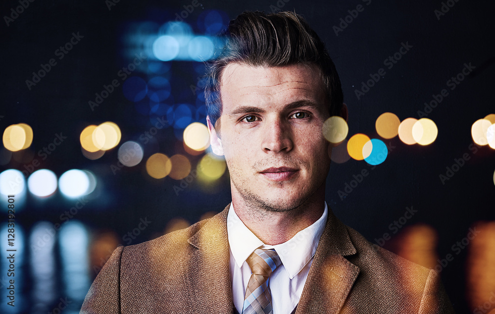
It goes without saying that lighting plays a big role in the success of your image, but what exactly does “good lighting” mean? In the case of lifestyle photography that is often shown in marketing materials, it’s easier to give tips on the types of lighting to avoid:
- Flat light: This removes contrast and can make subjects appear washed out.
- Mixed lighting sources: These can make the photo feel uneven.
- Images that are too bright or too dark: These are often due to overexposure or underexposure.
- Unrealistic coloring: This includes images that are two-toned or overly saturated.
- Overdone and unnatural bokeh: Bokeh is the blurring of the foreground and/or background around a subject, creating a dreamlike or aesthetic effect. While it can enhance a photo, too much bokeh can look artificial.


4. Overused visuals
In the B2B world, there are certain frequently used visual scenarios that oftentimes seem outdated or overused. While not necessarily off limits, they should be used sparingly to avoid visual fatigue. Scenarios to reconsider include:
- The business handshake: This can feel generic. Think about showcasing connections in a different way.
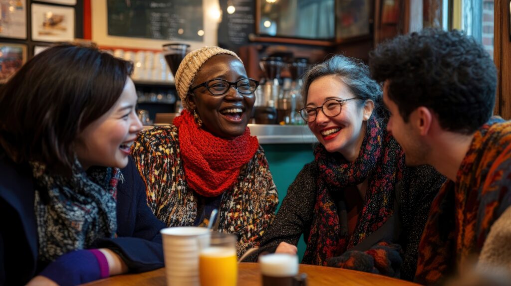
- The “cookie cutter” multicultural team: One way to show collaboration and diversity more authentically is to seek out photos that make you feel like you are observing a genuine moment, not just a group of people sitting on a college quad. People are more likely to connect with images where they can see themselves reflected in the situation.
- The laptop: While relevant, this type of image is overly used in B2B marketing photography. Instead, use different visualizations of work to reflect how we work today — varied devices, coworking spaces, virtual meeting spaces, etc.


5. Showcasing diversity in your stock photography
It goes without saying that society has often struggled to accurately and adequately reflect marginalized communities in visual media. It’s up to us as advertisers to actively ensure that diverse backgrounds and characteristics — including varied races, ages, gender identities, physical abilities and cognitive abilities — get the representation they deserve. Some tips for remaining value aligned when choosing stock images can include:
- Vary the focus: Ensure that the visuals depict people in various roles and scenarios, moving beyond limited or stereotypical portrayals.
- Authentic interactions: Look for photos where diverse individuals are interacting authentically and the diversity feels like a natural part of the scene, not a deliberate spotlight.
- Don’t force it: It’s essential to be mindful of and actively avoid any visual representations that feel forced, tokenizing, or rely on harmful and outdated stereotypes. The goal is authentic representation, not a superficial “checklist.”
- Be aware of the biases within your industry: If you talk the talk, you have to walk the walk. Stay away from showing a forced blend of folks if your organization is not doing the work to better things for the marginalized customers you serve.


6. Real > AI
In addition to selecting photography that acknowledges the world’s diversity, it’s important to keep in mind that your selections feel authentic and “real.” With the rise of AI, it may feel tempting to lean on these types of programs to generate the “perfect” image. AI technology often struggles with nuanced details like hands, and faces can appear unnaturally smooth and “perfect”. Many stock websites now allow you to customize your search settings, and you can deselect AI images showing up in your feed altogether.


So now you have some helpful tips, but you may be wondering where you go from here. When it comes to searching for stock photography for your brand, the advanced search bar of any stock website is your best friend. When searching:
- Filter your asset type: Stock sites offer much more than photography — avoid being bombarded by other assets you may not be looking for, such as videos, illustrations or vector art.
- Strive for authenticity: To ensure greater authenticity in your images, check off “don’t include AI.”
- Be specific…but not too specific: Start your image search broadly, then gradually narrow it down. For instance, a search for “three people hiking in Colorado wearing red” likely won’t yield many results. Instead, try something simpler like “hiker group in mountains.” If you find a close match, many sites offer a “choose similar” option. I often use this feature to explore related images until I discover the perfect one.
I believe that by thoughtfully applying these tips, you can transform your approach to stock photography. Over the years, I’ve found that these strategies have not only guided and streamlined my own search for effective imagery but have also benefitted the stakeholders I work with. I hope these insights resonate with you so that you can enhance the overall look and feel of your marketing materials with greater ease!