Rebrand confidently with our logo cheat sheet

More than two decades of designing and redesigning logos has taught us quite a bit. Selecting a new or new-ish logo is a huge step for any brand at any size. A logo is a powerful visual mark that communicates who you are and what you do — done well, it endures for years, sometimes decades, to come. The last thing any marketer wants to do is choose a logo in haste or uncertainty, wasting time and budget in the process.
In order to help you in your design process, we wanted to share the logo criteria worksheet we often give to our clients. This guide allows you to take a step back and outline the must-haves and must-nots in your logo. It also allows you to use these written criteria as your north star throughout the process (which gets messy, trust us).
Here it is:
McGuffin’s Guide to Logo Criteria:
Download a PDF of this worksheet here.
Before we begin to develop options for your logo, we first need to identify a few key pieces of criteria. This information will be used to guide our concepts as well as become a helpful tool in choosing your favorite logo.
One of the most important things to know when selecting a logo is that your logo cannot and will never be able to articulate everything you want to say about your brand or business. The logo is the mark that people identify with your business. It is one part of your brand that is also made up of your product/service, your employees, the storytelling on your website, your marketing materials, your social media channels, how you position yourself, what you say in your emails, etc.
A logo is simply the visual representation of your brand. So allow it to carry the weight that it naturally does, but don’t feel that it needs to carry the entire brand.
During this journey it’s helpful to keep in mind the principles of effective logo design:
- Simple – Logos shouldn’t be complicated or try to encompass your entire story. They should be legible at a variety of sizes and work in a single color.
- Versatile – Can be used on a variety of media including website, email signature, mailers, embroidered shirts, business cards, hats, mugs, etc.
- Ownable – Should feel distinct within your competitive landscape.
- Appropriate – Aligns with your predetermined parameters and effectively serves its intended purpose.
Questions to develop your criteria:
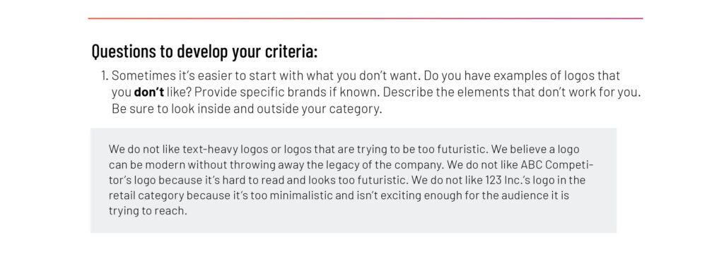
1. Sometimes it’s easier to start with what you don’t want. Do you have examples of logos that you don’t like? Provide specific brands if known. Describe the elements that don’t work for you. Be sure to look inside and outside your category.
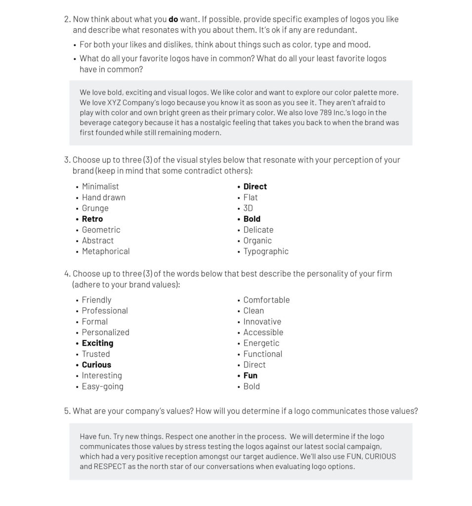
2. Now think about what you do want. If possible, provide specific examples of logos you like and describe what resonates with you about them. It’s ok if any are redundant.
- For both your likes and dislikes, think about things such as color, type and mood.
- What do all your favorite logos have in common? What do all your least favorite logos have in common?
3. Choose up to three (3) of the visual styles below that resonate with your perception of your brand (keep in mind that some contradict others):
- Minimalist
- Hand-drawn
- Grunge
- Retro
- Geometric
- Abstract
- Metaphorical
- Direct
- Flat
- 3D
- Bold
- Delicate
- Organic
- Typographic
4. Choose up to three (3) of the words below that best describe the personality of your brand (adhere to your brand values):
- Friendly
- Professional
- Formal
- Personalized
- Exciting
- Trusted
- Curious
- Interesting
- Easy-going
- Comfortable
- Clean
- Innovative
- Accessible
- Energetic
- Functional
- Direct
- Fun
- Bold
5. What are your company’s values? How will you determine if a logo communicates those values?
We’ve gone ahead and filled out a sample worksheet for you to see what we mean. Pretend we’re a software company currently rebranding:
We have much more content on logos, naming and all the things necessary for a rebrand on McGuffin Mix.

