5 design trends on the rise in 2025
Like an engineer eyeing a building code violation or a doctor inspecting an MRI result, graphic designers spot things in the visual landscape that those of us who don’t spend our days parsing Pantone colors, font ligatures and subtle background textures might miss.
With a new year ahead of us, McGuffin assembled a handful of design pros from our creative team to discuss what we see emerging in 2025 — and a few things we hope will be relegated to the dustbin of history.
1. Collages and textures for a human touch
In the age of AI, we’re starting to see some backlash in the design world in the form of collages and textures being incorporated into digital design. Grain and grit convey authenticity in contrast to the smooth perfectionism of AI.
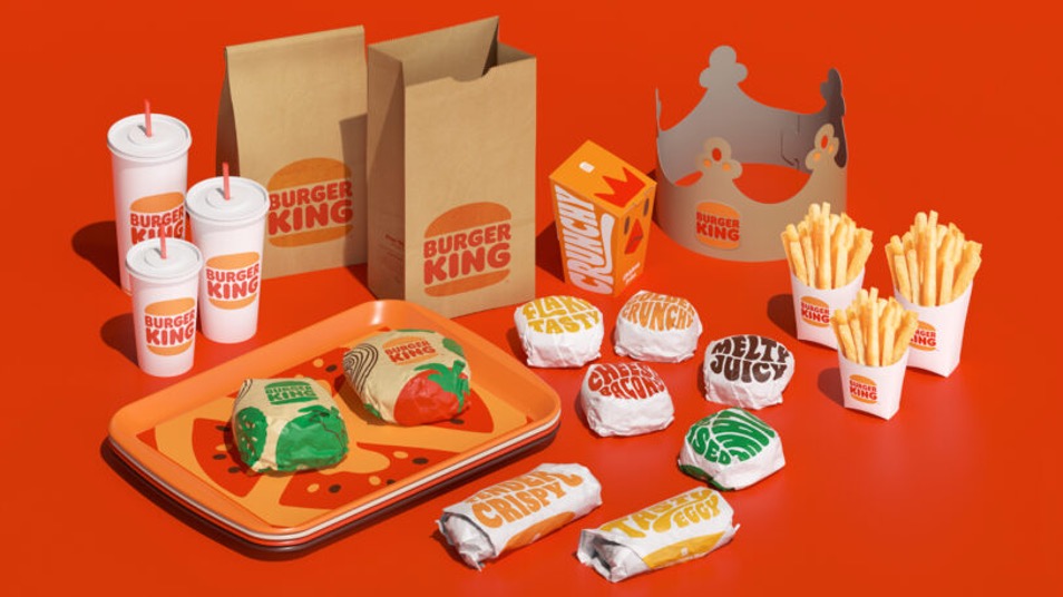
Sid Sidani: I think the thing that I see most frequently is kind of like a handcrafted collage, things that aren’t so computer-based. I think that there’s been a rebellion against AI in design where designers are like, “we want things that feel human and authentic,” and having that collage-y, textured feel is one of those ways. I’ve also been seeing fun kinds of 70s retro typefaces coming up a lot in branding, which has been cool and exciting. We can see it throughout a few brands already, like Burger King and Nutter Butter, but it’s definitely being pushed.
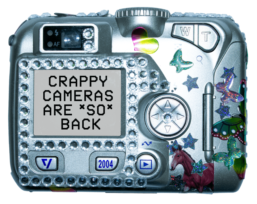
Valerie Rausch: I agree, AI is interesting, but people want that more realistic look. Even thinking about photography, people are looking for unretouched stuff. Gen Z Is like, give me a point and shoot — you know, an old digital camera or a disposable camera — and taking pictures with those. And I’m all here for that. I love it. And I think there’s the other side of AI where people are going to start trying to use it in way more creative ways. Like, okay, what can AI make for me? What else can I do with it? And really bringing the creative person into the process.
Sid: Yeah, I think that you also brought up a great point with a point-and-shoot. I think grain is something we’re going to see a lot more of… things that feel a little bit almost dirty. Like blemished photography or models that don’t look perfect, you know?
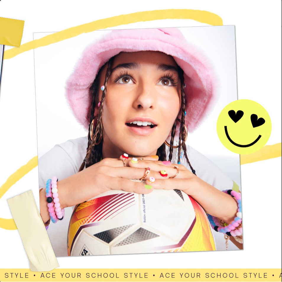
Bob Sprecher: People are hungry for authenticity in a hyper-digital world. That’s why I think the retro, kind of structured scrapbooking that you’re talking about is showing up more and more. I’ve been seeing stuff, too, when it comes to minimalism, where illustration is being paired with simple design to give it a maximum minimalism feel. Complex illustration paired with simple design help to give you that unique personality you’re looking for, and then clients get the best of both worlds.
Illustration is always making a comeback, it seems. So, it’s kind of funny that illustration is gonna be big this year. Well, it’s big every year, it just changes and cycles through different trends. In the end, it’s all about giving off an authentic impression and avoiding the same-y, me-too branding that is so prevalent.
2. Simplification of logo typefaces
We have mixed feelings about the continuing trend toward simplicity in logos, aka “blanding.” From Jaguar’s controversial rebrand to fashion and tech companies embracing sans serif, this is happening across industries. However, this trend isn’t necessarily new when you look back at design history.
Sid: More and more brands are leaning into very minimalist typefaces like [automaker] Jaguar. Everyone on LinkedIn had something to say about Jaguar and their moving away from icons and logo marks, and just leaning on a simplified wordmark, which I am kind of sad about. You can see it in a lot of brands. But it just takes away a lot of the personality.
Valerie: I see logos, like Pinterest and PayPal and Google, that have gotten rid of their uniqueness. It’s this very sans serif, just almost nothingness font. And they all look the same. I feel that’s been going on for a while.
Sid: I’m going to go a little sociopolitical here. A part of it, I think, is that we have an extreme wealth gap, and it’s seen as kind of tacky to really be flaunting logos in the way that we used to. A cool logo used to be a cool thing. I think that they’re paring down logos so they don’t stand out as much.
Valerie: Hmm! That’s interesting.
Chris Sculles: This trend toward simplification isn’t new. Look back at the early seventies when there was a Swiss design wave where, all of a sudden, everyone brought their fonts to a designer, and they turned it into Helvetica. So, this isn’t new.
I do think that oversimplification has happened before. Then the backlash was waves and swishes, which was horrible. I think a kind of new thing is the oversimplification of colors. I think that’s going to be new. People owning a color just doesn’t really happen anymore. Like how many colored shapes are there that you can own? Coca-Cola red? IBM’s Big Blue? It’s not a thing anymore.
Sid: I do think that waves and swishes are coming in — like I’ve seen a ton, especially in the makeup space with really funky shaped bottles, things that feel very anthropomorphic or like organically shaped.
Bob: Yeah, I’ve been wondering over the years as it pertains to logos being simplified and made more readable — was it a result of laying logos over photography on websites and social media?
Valerie: And then, having, like a screen of color lay on top of the photo.
Bob: That started several years ago, and nothing worked. So, I think people started to simplify their logos just so that you could lay it over images, and especially on websites and social.
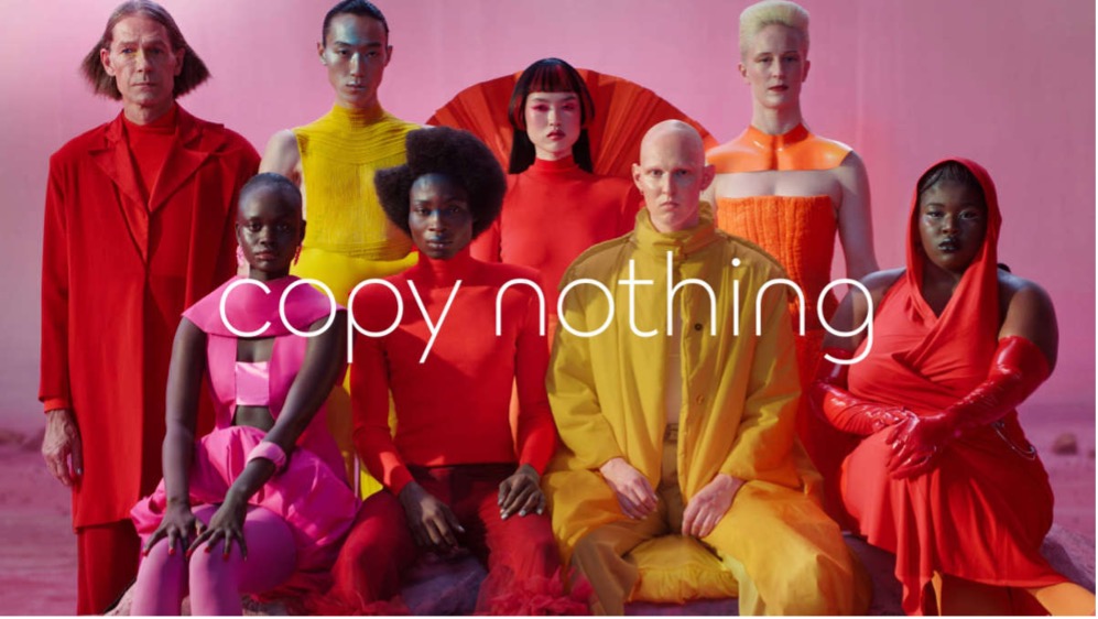
3. Anti-design
We’re here for the trend of anti-design. Charli XCX’s “Brat” album kicked off “brat summer” in 2024, which took over social media for months— quite the feat given the short life span of virality nowadays. The leaked creative brief for “Brat” even made its rounds on LinkedIn as an inspiration to marketers. We see the anti-design trend continuing in 2025.

Emily Cullitan: I feel like another sort of trend is anti-design, especially if you think about “brat summer.” Granted that was this past summer, but you know it’s this bright kind of ugly green, and then a purposefully blurry word, “brat.” I feel like a lot of people are purposely breaking the rules and purposely designing things that are chaotic, but also kind of beautiful just as a way to, you know, break the grid and try new things. It’s kind of difficult to look at sometimes, but it’s also a little bit refreshing.
4. AI for enhancement, not replacement
You won’t see us bashing AI here. It increases efficiency for designers when it comes to tedious tasks that used to take ages, like outlining photos. It also helps with brainstorming, adding background images and so much more. But when AI is talked about as a replacement for creative thinking, that’s where we draw a line.
Bob: Yeah, I have on my list: AI enhanced. So, it’s kind of embedded into your own interpretation of whatever you’re designing, so it’s essentially hidden. It’s being used to help you get to where you want to get to conceptually. But AI is the tool, not the artisan. I don’t leave my power tool in the garage with a piece of wood, walk into the house and go,” I’ll come back when you’re done.”
I think that use falls under the umbrella, which is what you guys are describing, of authentic.
Chris: Well, I remember back in the day spending a week outlining photos. That’s not creative. But with AI, you can do it in almost no time, so that just saved a client like a week’s worth of billing. And then any image that you need of outdoors, AI is great. You’re like, I need a landscape on a pond with a lily pad. Great! I mean, it’s there. You don’t need a photo shoot for that. So that’s what it’s like, right now. That’s its best use for me.
Valerie: I use it to help me with logo design or to help me come up with some other metaphors for certain things that are less cliche. Give me some synonyms that I can use to spark my mind to come up with a cool solution.
Chris: It is a great brainstorming partner. But it still kind of writes like a 7th grader.
Bob: And by using it as just another tool at our disposal, we’re also safeguarding the creative and the creative process. We’re not handing over the reins.
AI is the tool, not the artisan. I don’t leave my power tool in the garage with a piece of wood, walk into the house and go, ‘I’ll come back when you’re done.’
– Bob Sprecher, Chief Creative Officer, McGuffin
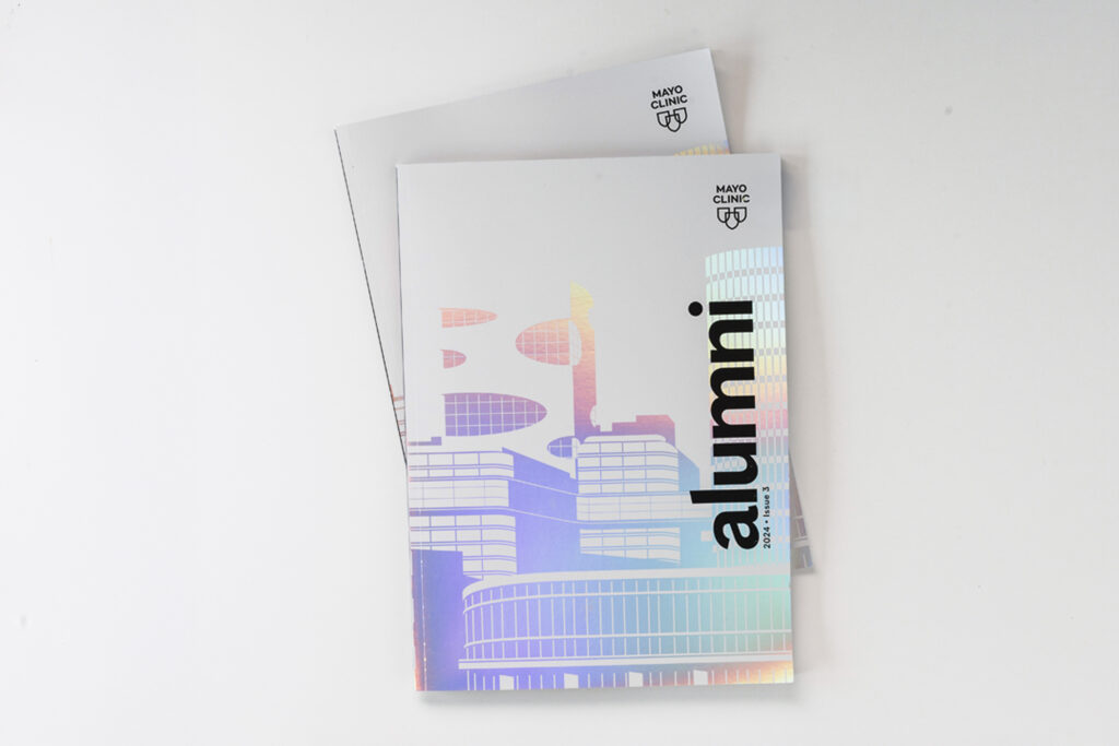
5. Print for stand-out items
While digital and social is obviously where most ad spend will continue to go, that doesn’t mean there isn’t room for print. Print can be a way to create a stand-out piece that customers may even want to display.
Valerie: Emily set up this awesome paper meeting last month, and they were talking about paper trends, and one of the things they were saying is how paper is coming back, because people want the tactile-ness of it. It made me think of magazines in particular. The way some of our clients are thinking about them is that these are pieces you want to keep and put on your coffee table or display them in your office, so I think that’s really interesting. I think that’s kind of rejection of digital and AI, embracing that more tactile nature.
Emily: I feel like that ties into the rise in people reading more books — and actual books. Yes, there’s also a rise in Kindles, but there’s a Barnes & Noble that opened up probably half a mile from me. I think people are itching for print and for those physical things that you can actually hold onto and touch and interact with, because digital can be such an exaggerated and impersonal thing.
Chris: I think it’s worthwhile to do something memorable. But I don’t think anyone’s just printing in bulk anymore. If you’re going to do something in print you have to do something that matters. That stands out. Something special. But it’s not going to replace your LinkedIn ad spend.
Thanks to our team members for their insights: Emily Cullitan (Designer), Valerie Rausch (Creative Director), Chris Sculles (President), Sid Sidani (Art Director), Bob Sprecher (Chief Creative Officer)