Our work
Bank of the West
The Ask
89% of businesses research purchasing decisions online before making a commitment to buy. For Bank of the West, this means that their small business website experience has to be engaging, differentiating and easy to navigate, and help business owners understand how the bank’s offerings are the best match for their needs. McGuffin was tapped to redesign a confusing, product-first site with low engagement and a high level of lead form abandonment.The Answer
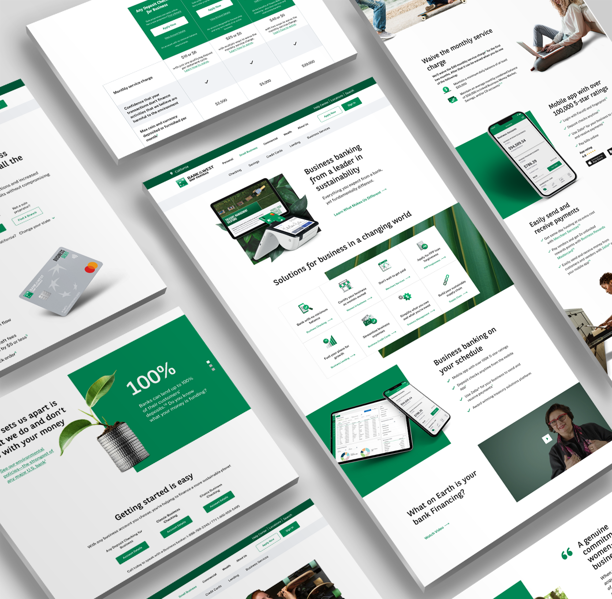
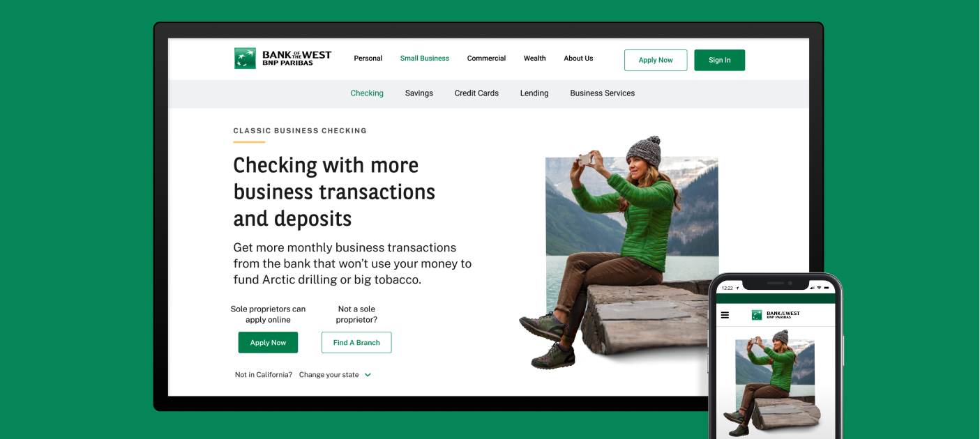
After completing extensive discovery that revealed small business motivators for considering and choosing a bank, McGuffin redesigned the small business section of the bank’s website, creating a distinctive, needs-based and values-forward experience. We tested navigation and journey concepts and designed the site that provides the best discovery experience for small businesses. Exploration of the site now enables businesses to move toward a purchasing decision.What we did
- Stakeholder and prospect interviews
- User flows
- Wireframes
- Web design
- Information architecture
- Tree tests
- User testing
- Web asset creation
Stakeholder and Prospect Interviews
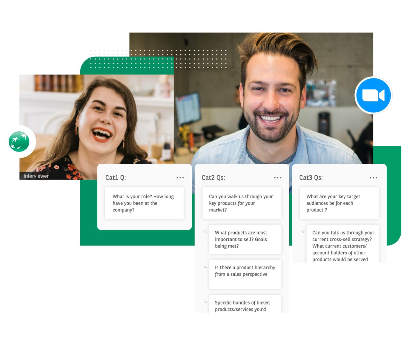
We began discovery with deep dive interviews with key roles across the bank; sales, marketing, analytics, product, customer experience and more in customer-facing and leadership positions. With a firm understanding of the bank’s perspective and goals, we next completed qualitative research, interviewing 18 owners of businesses varying in size/revenue, industry, and US location. We asked them how they used their bank’s website, what digital tools were important to them, what products or services they use/need, what business problems they need help with, and, most importantly, what was missing from their banking relationship.
Information Architecture
Stakeholder interviews surfaced insights pointing to several areas small to medium businesses focus on when evaluating service providers:
- Business challenges solved
- Initiating contact
- Products and offers
- Brand positioning/values
- Customer testimonials
- Digital tools/services
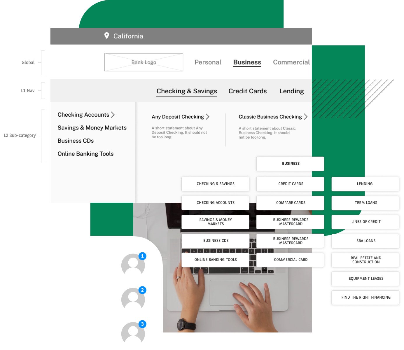
We then identified and created business homepage content categories, the homepage hierarchy, category-level page architecture and nomenclature.
User Flows
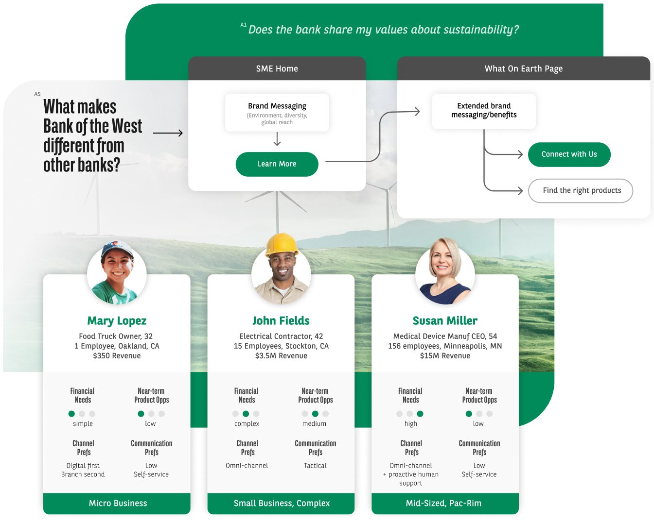
We tested our information architecture hypothesis against three primary target personas. The performed tasks of the user flows validated our assumptions and informed changes that would improve the navigation experience and overall engagement.
Tree Tests
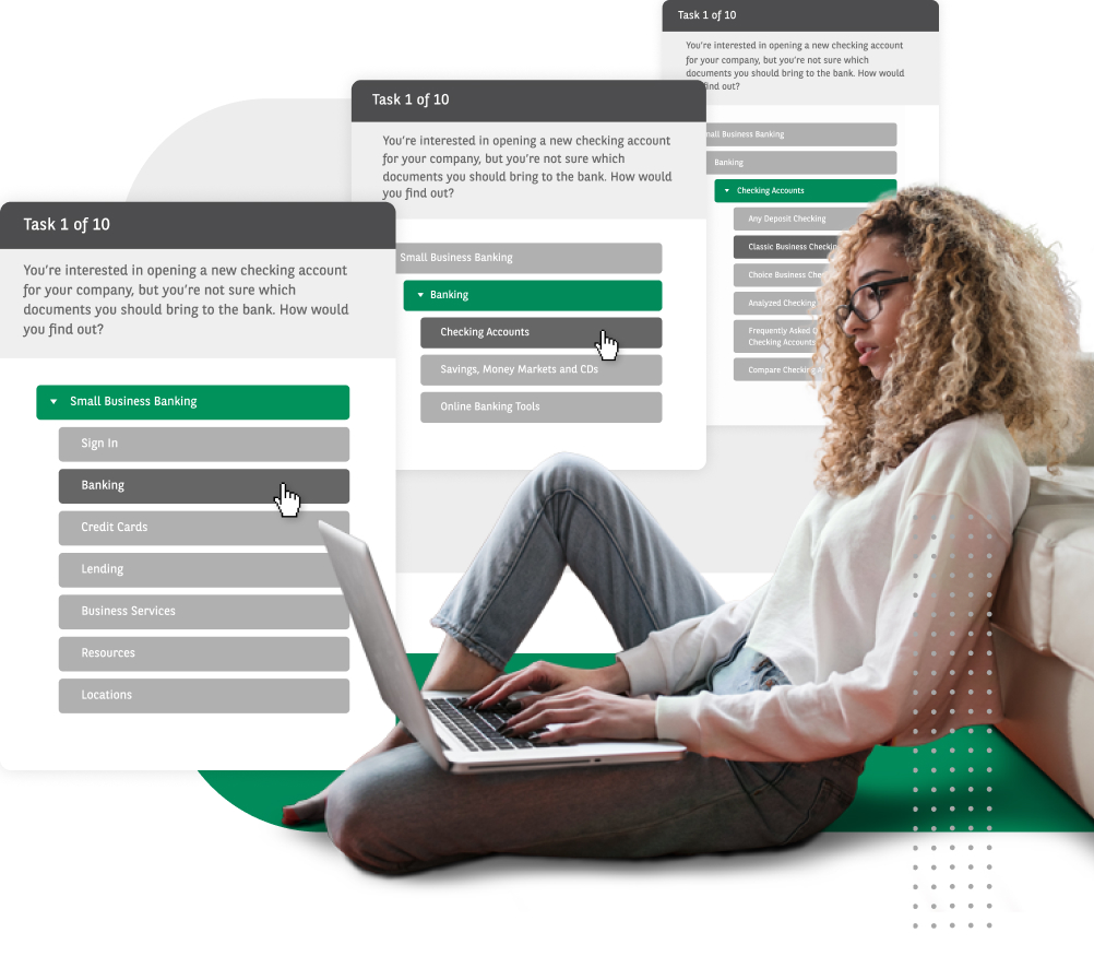
For our first user test, our goal was to validate the revised information architecture. The Tree Tests allowed us to focus on sitemap navigation and labels, without page design. In other words, if small business users had to rely on only the menus to navigate, how well could they do it? Could they easily find the information they need?
Wireframes
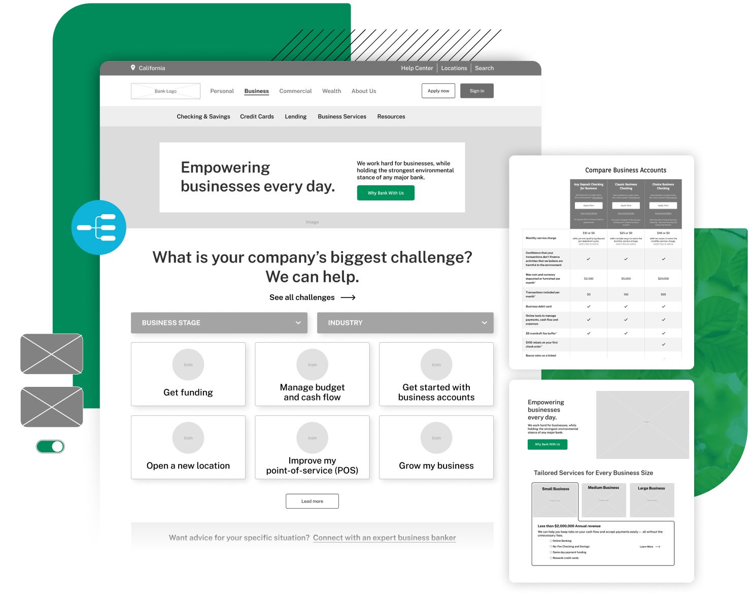
Outputs of our interviews, information architecture, user flows and tree tests all worked together to support, challenge and inform our hypothesis. For the user testing sessions, we created wireframes providing two different homepage experiences. Once the testing was complete, we moved on to create the remaining pages for the business section.
User Testing
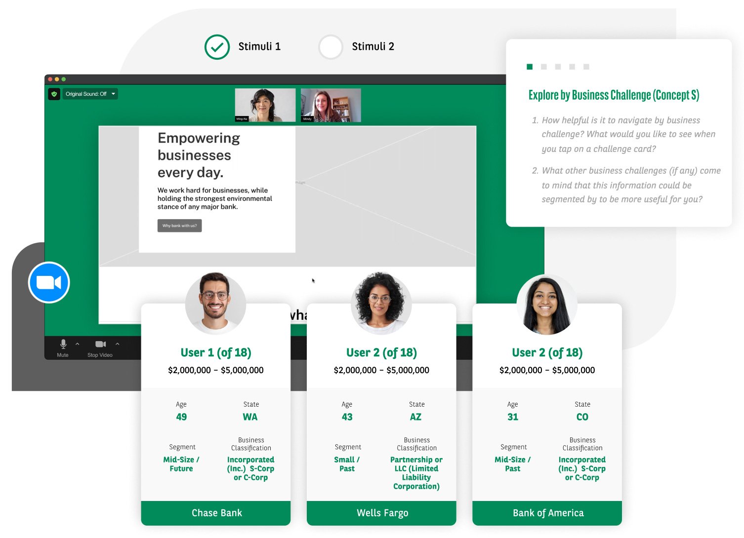
We tested three unbranded concepts (stimuli) with 11 different information modules. Test participants represented a relatively even mix of businesses whose annual revenue ranged from $100,000 to $2,000,000.
Our desired outcome for the research was to assess the effectiveness of each concept and individual module. We wanted to determine which combination proved the most useful in helping a business prospect move forward in the journey toward a purchase decision with Bank of the West.
