Typography’s impact on your brand is bigger than you think
Typography isn’t just about aesthetics; it’s the flag-bearer of your brand strategy and a necessity when it comes to design. Your brand’s typography is often the first impression you make on your customers, especially as we move almost entirely into the digital sphere.
Think about your Instagram feed. For a brand, the logo is present in the profile image but the post itself is often recognizable because of the chosen typography. For example: The New York Times uses a serif font on social media to evoke trustworthiness and prestige:
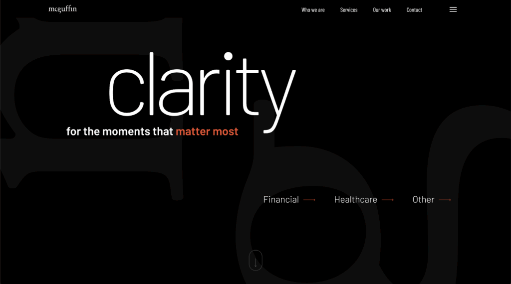
On our own website, we use a font called Barlow because it’s easy to read, inviting and smart:
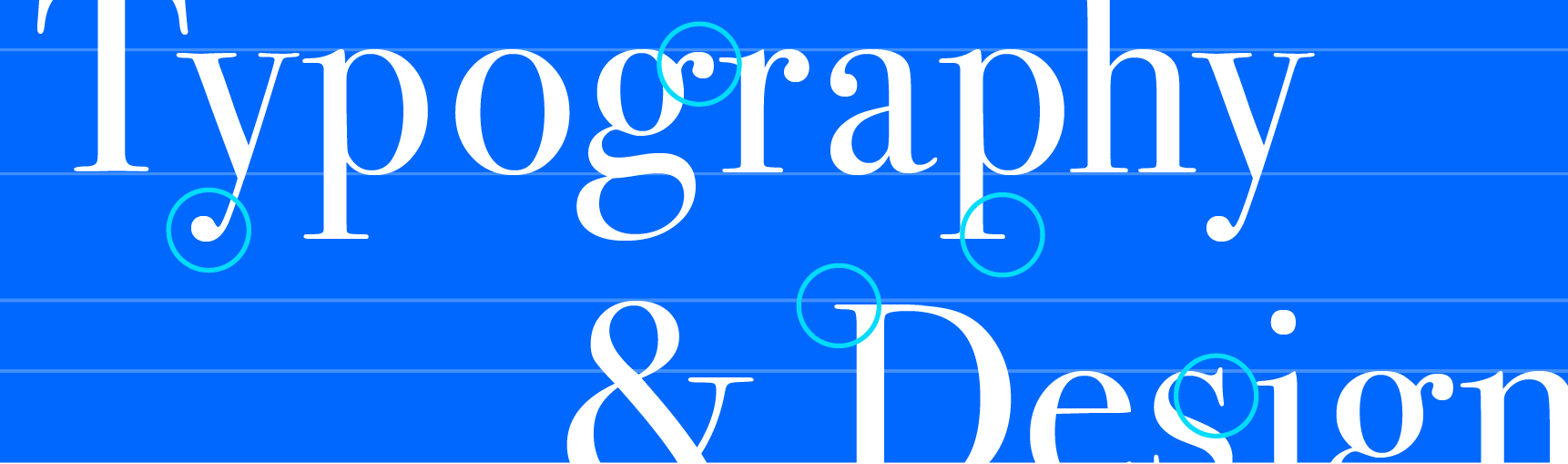
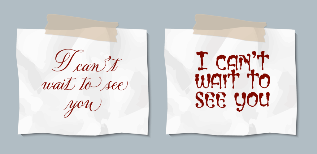
Before color, logo or product, font is often the first clue of a brand’s overall vibe. The right font can make your brand feel trustworthy, playful or confident. The wrong one can make it forgettable or even sinister:
But how do you navigate the esoteric world of typography? And what is typography anyway? Let’s start with some definitions, then move onto some tips.
Type terminology
In the design world, you’ll often hear the terms “typography,” “type,” “fonts” and “typefaces” thrown around at random. Although you’ll often hear these used interchangeably, they have importantly distinct meanings. A former professor of mine, Mary Jo Krysinski, lays these definitions out clearly in her book, “The Art of Type and Typography”:
- Typography: The arrangement of words in a way that communicates meaning and content.
- Type: The physical object, a piece of metal with a raised face on one side containing the reversed image of a character. The digital form — individual glyphs or characters.
- Fonts: A set of characters of a given typeface, all of one size and style.
- Typefaces: A set of fonts of related design or style — Roman, italic, bold, etc.
Under these umbrellas there are different classifications of typefaces with varying degrees of popularity. These include:
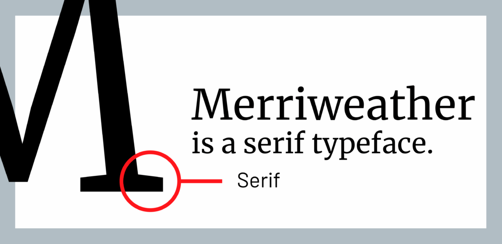
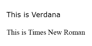
1. Serif typeface: A typeface that includes small strokes that protrude from the letterforms. These strokes are called serifs.
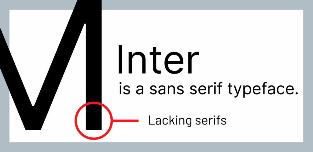
2. Sans serif typeface: A typeface that omits the serifs. Typically, these are built from simplified lines.
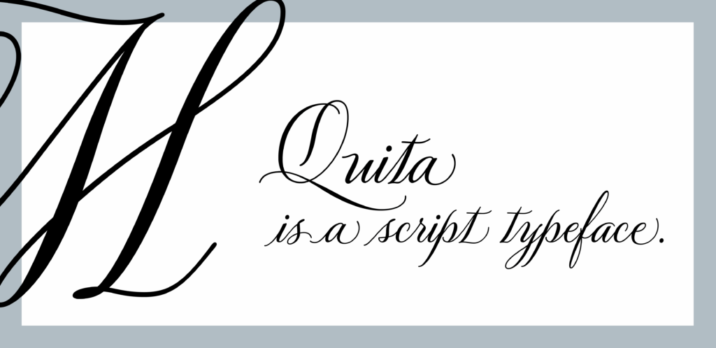
3. Script typeface: A decorative typeface that mimics handlettering or calligraphy.
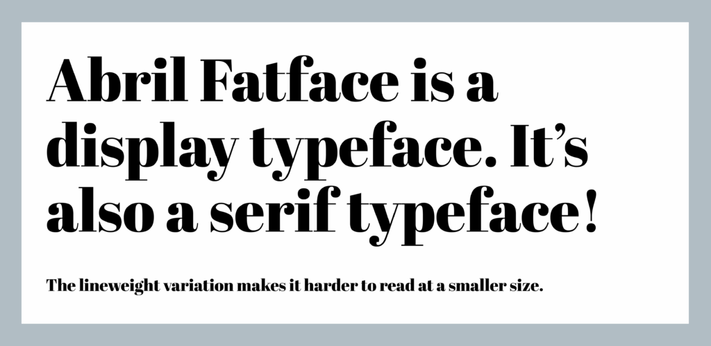
4. Display typeface: A typeface that is intended to highlight text at large sizes such as titles, headings and pull quotes. It is not intended for large body copy and can hurt legibility when used at a smaller scale.
Now that we’ve got those definitions under our belt, here are a few tips to best utilize typography:
1. Sans serif typefaces are better for lower-resolution media
Tiny banner ads? Social posts stuck at 72dpi? Using a sans serif typeface, especially at smaller sizes, is better for readability as there is less visual clutter in the type and therefore it has less of a blurring effect at a lower resolution.
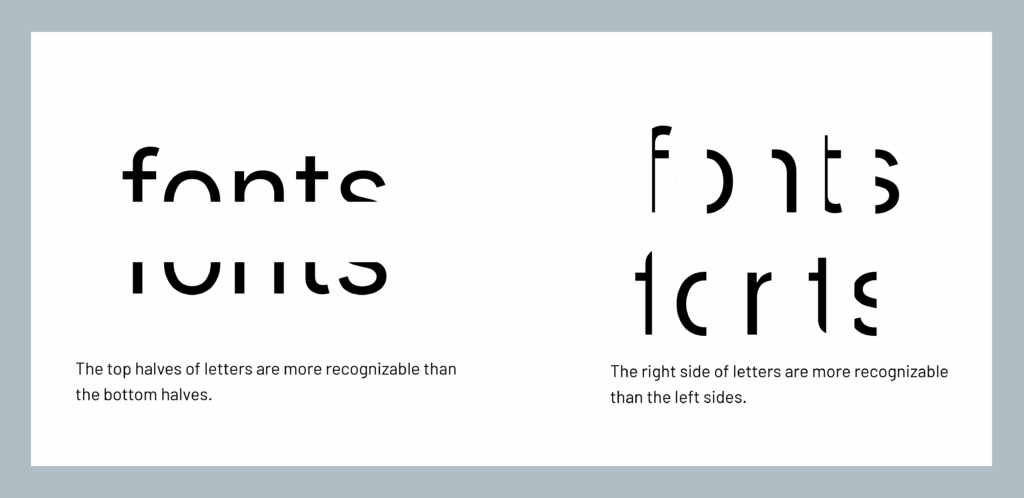
2. Know where to crop if playing with typefaces
Playing around with your type is a way to bring some personality to your brand, but should not compromise the legibility of your copy. When cropping, remember that the top halves of your letters are more recognizable than the bottom halves, whilst the right side of letters are more recognizable than the left sides.
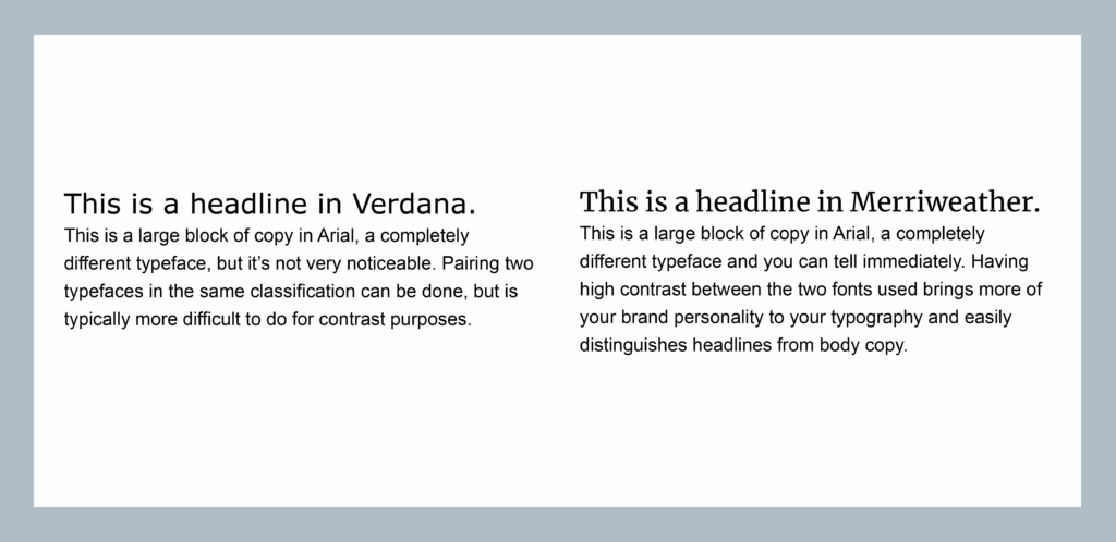
3. Pairing typefaces
Pairing typefaces can be overwhelming with the wide array available. I recommend starting with two typefaces that feel like they evoke the voice of your brand. Typeface families have a wide variety of fonts available that can provide the hierarchy needed for your goal without needing to add another to the mix. You want at least one that is legible in large blocks of copy and the two typefaces should have enough contrast so that they are distinguishable as two different fonts.
What marketers should understand about type
While designers like me love getting into the nitty gritty details of typography, you may be thinking: how is this knowledge helpful to me as a marketing or communications person? While you can leave the minutiae to the designers, it’s your job to be the brand steward, which includes the visual cohesiveness of your brand. There is generally a lot of focus on color and logo in marketing, which are very important parts of any brand. But typography is just as impactful as the other more top-of-mind brand elements.
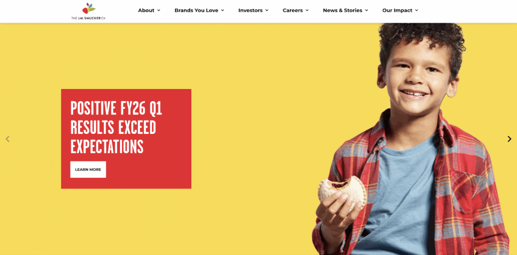
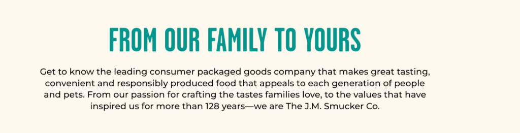
For example, the current trend in corporate branding is to move away from scripted or heritage text and toward more sanitized, clean fonts. For some brands this works well to modernize or tighten their brand image. For others, it can dilute the brand and leave customers feeling like something’s off. J.M. Smucker Co. website moved from a varied font mix and photography-forward website to a much more paired down look and feel. To me, although “cleaner,” it feels a lot less approachable and friendly. The same message, “From our family to yours,” can still be found on the website but removing the sentence case and script typeface to replace it with an all caps simplified typeface doesn’t evoke the same family-friendly message. In this case, switching up the typography made a significant impact on the visual brand.

If you want to dive deeper into the world of typography, I recommend picking up a copy of “The Art of Type and Typography”, or reaching out to us to explore how your brand can come to life, even (and especially) in the weird world of typography.