

 Progress:
Avoid the “Sea of Sameness” Design Trap
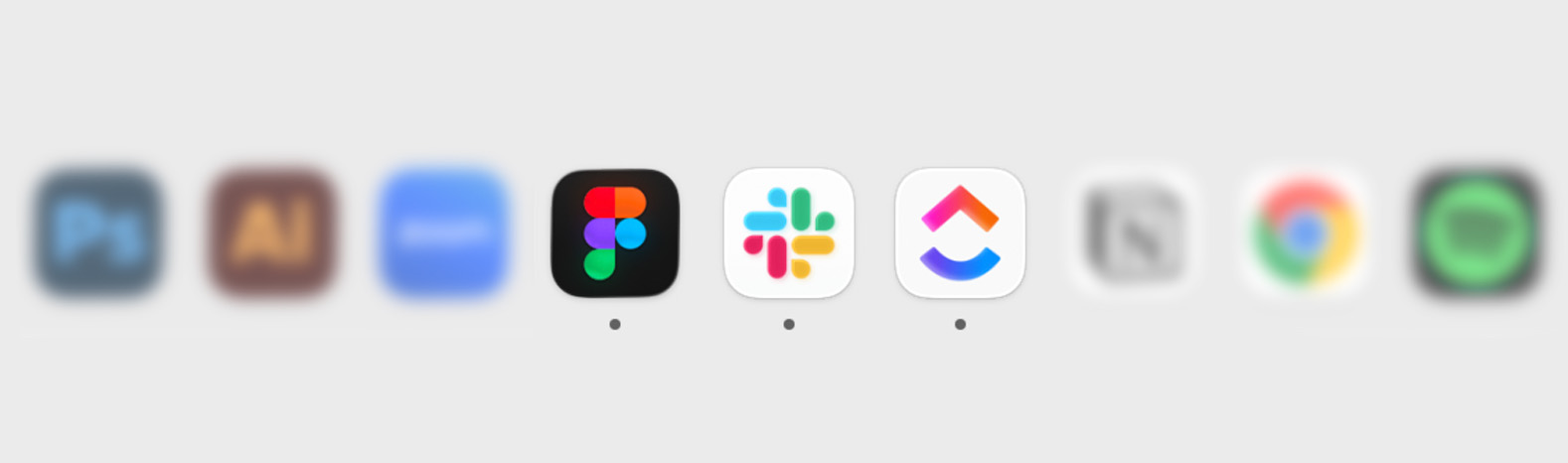
So…I clicked on the wrong app again.
Not because I wasn’t paying attention, but because three of the apps I use every day have started looking remarkably similar. Each one shares the same clean, rounded, colorful aesthetic and when sitting side by side in my dock. Distinguishing between them takes an extra second of thought. It made me wonder: when did so many apps start looking alike? And more importantly, what does that mean for the future of distinctive design?
Why every app looks the same
We’re living in an era of endless inspiration. Every day we’re exposed to hundreds of logos, illustrations, advertisements and social posts. It’s never been easier to find great creative work or see what’s resonating with audiences. Yet when we’re all consuming the same inspiration, it’s easy to start making similar creative choices. Those choices aren’t necessarily bad on their own, but when they become the default, brands lose the visual cues and personality that help people recognize and remember them.
Take the Corporate Memphis illustration style that Facebook popularized in 2017. It wasn’t designed to be especially expressive; it was designed to be practical. The simplified, ambiguous characters were easy to scale, adapt and reuse across countless scenarios. By avoiding defining characteristics, the illustrations became universally applicable. But that’s also what made them feel…forgettable.
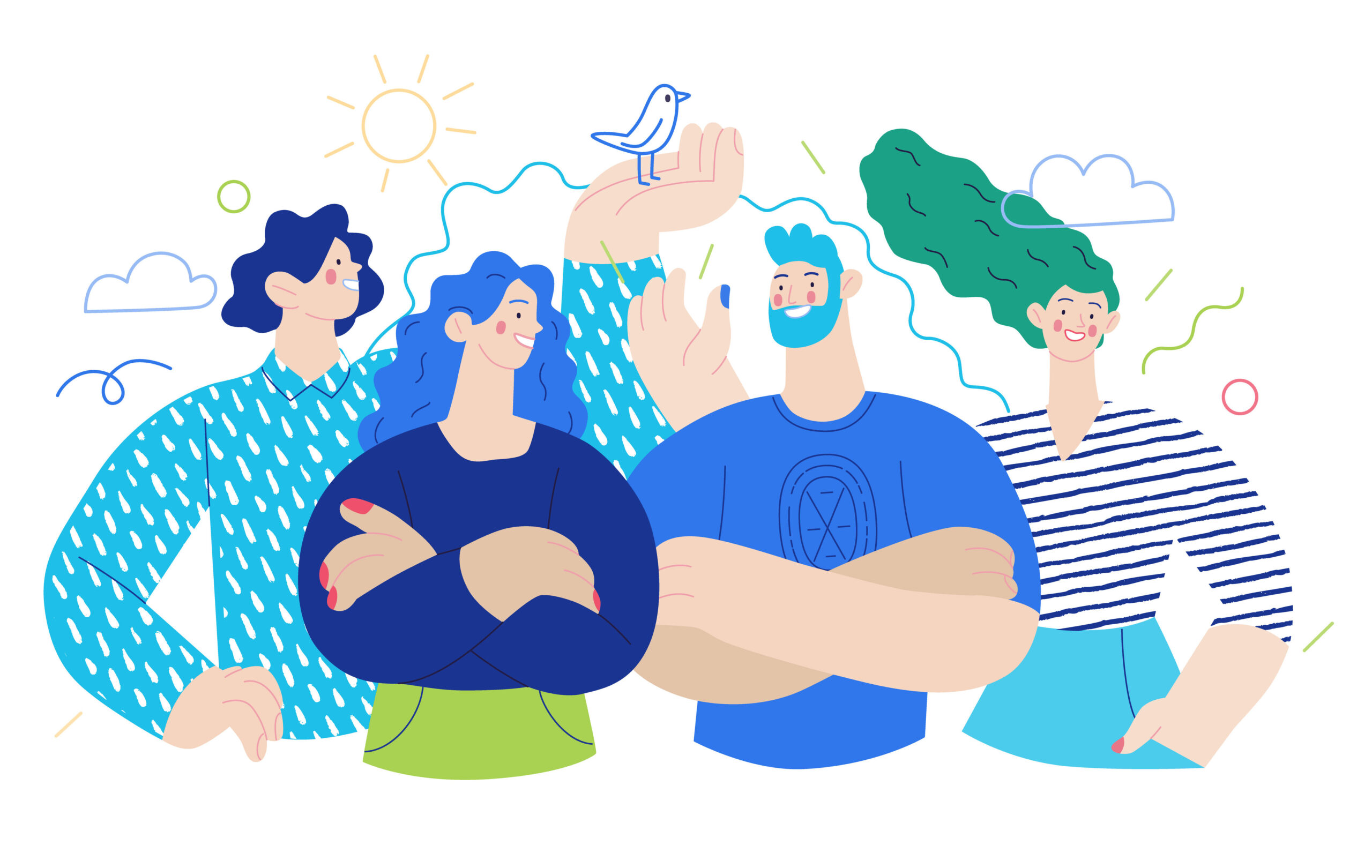
As stock illustration libraries adopted the style, it showed up everywhere. What started as an efficient design system eventually turned into corporate sameness. By the early 2020s, Corporate Memphis had become one of the most recognizable examples of corporate design homogenization.
AI has also accelerated this tendency to create based on similar choices. Because artificial intelligence platforms are trained on enormous collections of existing work, they naturally identify existing patterns. The more brands rely on those models, the easier it becomes for creative work to converge toward similar solutions.
So, how do you avoid the sea of sameness?
The next time you open your dock or mobile apps, remember: the strongest brands aren’t the ones that try to look like every other icon, they’re the ones you recognize instantly.
Tip #1: Build for your specific audience, not mass appeal
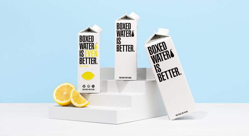
Boxed Water is a great example of what happens when a brand understands what matters to its audience. Rather than trying to compete with traditional bottled water brands on convenience or familiarity, Boxed Water positions itself around consumers who care about sustainability and want their everyday choices to have less of an impact on the environment. That idea shows up throughout the brand, from its plastic-free packaging to its messaging around recycling and reducing waste. The result is a brand that feels intentionally built around a specific set of values, rather than trying to be everything for everyone.

Tip #2: Consider the full picture
Too often, brands jump straight to aesthetics before establishing a strategy. Yet strong branding stretches beyond colors, logos and typography. It’s built through positioning, perception, customer experience, tone of voice, messaging and the journey you create. Visual identity is important, but it’s only one piece of a much larger story.
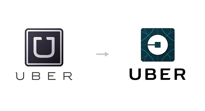
Uber’s rebrand is a good reminder that a new look can’t solve a larger brand problem. In 2016, Uber shifted its positioning from a ride sharing service to a global technology company. As a result, it decided its existing identity no longer reflected where the brand was headed. Uber introduced a completely new visual system designed to communicate a more modern and tech-driven company. A new visual identity couldn’t change how people actually experienced or perceived Uber. So before jumping into a redesign, brands need to understand what they stand for, how they are perceived, and what they actually offer. The visuals should come from that bigger picture, not the other way around.
Tip #3: Don’t chase trends, understand them
One of the biggest reasons brands begin to look alike is because they follow trends too closely. Whether it’s a visual aesthetic, an illustration style, a social media format or even a tone of voice, trends can be incredibly useful. They show us where culture is moving and what audiences are responding to.
The problem comes when a trend replaces a brand’s identity instead of supporting it. They collect inspiration, copy competitors and recreate whatever is performing well online — without first asking who they are trying to resonate most with. Strong brands don’t ignore trends; they filter them through their own lens. They create something within the trend without losing what makes them distinctive.
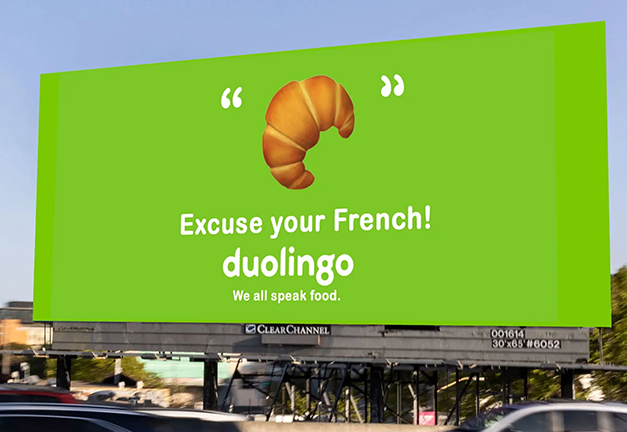
A successful example of this is Duolingo. The language learning platform uses similar visual “ingredients” as other tech companies — bright colors, rounded illustrations, playful animations. Yet what sets them apart is the quirky, playful personality sprinkled throughout their identity.
Tip #4: Use AI as a tool, not a design replacement
It’s safe to say that at this point there is no avoiding AI. It can be a great tool, as long as it doesn’t fully describe your entire story or define your brand’s voice. Use it to brainstorm ideas, explore alternatives, smooth the edges of a logo, or find a better synonym when you’re stuck.
A great reminder of where this can go wrong is the infamous Willy’s Chocolate Experience in Glasgow. The 2024 event was promoted with AI-generated images that showed a colorful, immersive wonderland. When families arrived, they found a sparsely decorated warehouse that looked nothing like what had been advertised. The event ultimately was shut down after complaints, with attendees demanding refunds.
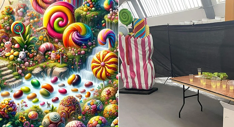
The takeaway? AI can’t replace your perspective, your experiences, your talent or the intuition that comes from understanding your audience. Those are the elements that make a brand feel human and those are the things people remember.
Ultimately, good design is human.
It flourishes from authentic conversations, lived experiences and a genuine understanding of the people you’re designing for. It also comes from looking beyond the design world — to other creative disciplines, culture and the world around you — and bringing those influences into your work.
As design becomes easier to generate and inspiration becomes infinitely accessible, those human qualities don’t become less important, they become the very thing that sets great brands apart.
Sources
Aesthetics Wiki. “Corporate Memphis.” https://aesthetics.fandom.com/wiki/Corporate_Memphis
Josh Gabert-Doyon, WIRED. “Why Does Every Advert Look the Same? Blame Corporate Memphis.” https://www.wired.com/story/corporate-memphis-design-tech/
Benjamin Hiorns, Creativepool. “If Distinction Is So Important, Why Do So Many Brands Look the Same?”
https://creativepool.com/magazine/features/if-distinction-is-so-important-why-do-so-many-brands-look-the-same-historymonth.29232
Rahul Prajapati, Bevichitra. “Why 90% of Brands Look the Same and How a Strong Brand Identity Breaks the Pattern.” https://bevichitra.com/blogs/why-90-of-brands-look-the-same-and-how-a-strong-brand-identity-breaks-the-pattern
Dale Wesdorp, Miyagami. “AI Killed the Brand Star: Why Everything Looks the Same.” https://www.miyagami.com/insights/ai-killed-the-brand-star-why-everything-looks-the-same
Matt Knorr, Look and Logo. “A Closer Look at the 2016 Uber Redesign.”
https://medium.com/look-and-logo/a-closer-look-at-the-2016-uber-redesign-1e4d4dea9ef