 Progress:
5 things we learned from making our first editorial website

Here at McGuffin, we make a lot of websites. Blogs, product pages, whole website redesigns — you name it, we’ve designed it. But until recently, there was a kind of site we hadn’t made: editorial. Then, not long ago, we got our chance. A client came to us seeking two things: a revival of their print magazine and an editorial website to go along with it.
The magazine was full of large, vibrant storytelling, with a mix of longer pieces and bite-sized content. The client wanted a site that would build on the magazine’s identity, offering a similar look and feel while leveraging the kind of content print could not. Readers would be able to enjoy a more widely available, interactive experience. Meanwhile, the client could track reader engagement, offer multimedia content and find new ways to grow their audience.
The magazine and website had to be developed simultaneously. So, staying in constant contact with the good folks in our print department, our web team got to work. It was a challenging project, but the end result was incredibly satisfying for us and the client — and we learned some things along the way:
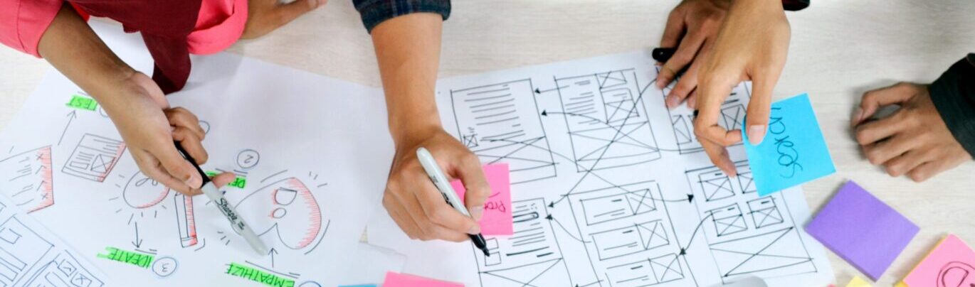
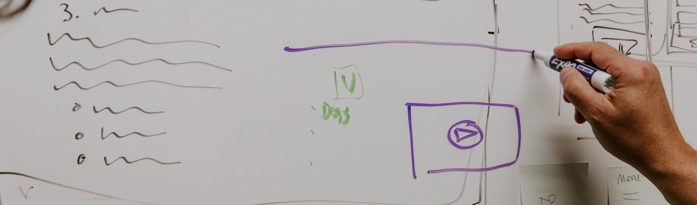
1. Get inspired — and get input as soon as possible.
At the start of the project, we knew that, first and foremost, we wanted to create an engaging experience. We reviewed sites and trends throughout the online editorial space, each of us identifying our favorite features, and brainstormed about how each could apply to our magazine. Once we had our dream state for the site, we shared wireframes with the client, who helped us turn it into their dream state.
Of course, dreams must give way to reality. The moment we knew what we wanted, we ran it by developers who explained what we could and couldn’t actually do. Not every feature made it into the final product. But being able to clearly articulate a vision for the site from the beginning made life easier as time went on.
2. Nothing’s 1:1, but print and digital can play off each other.
Having an existing brand to work from can be both an asset and a challenge. On the plus side, it gives you a starting point upon which to base your overall design. On the downside, design choices that work well in the print magazine can actually hamper the website’s functionality or accessibility. Take one example: the drop cap. It’s a common style element at the start of many print articles — a striking way to say “hey, the story’s starting!” and grab the reader’s eye. But it can cause issues with screen readers. We had to think through how that, and other routine design choices, could affect the accessibility of the site.
There’s also the issues of screen size and orientation. Reading a printed article in a magazine spread feels dynamic, in part, because your eyes are traveling from left to right across two pages. Once that article is out of your hands and on a monitor or tablet, the effect is lost. You can’t simply copy and paste text from one medium to another and call it a day. Ask yourself, “What needs to change in order to maintain the audience’s connection to the material?”
While print and digital can’t have a 1:1 relationship, they can play off each other’s strengths in interesting ways. The site might drive users to check out longer articles in the magazine. The magazine might use QR codes to direct readers to videos or podcasts expanding on topics only mentioned incidentally in a story. Thinking through how these media can support each other is an ongoing process.
3. An “evergreen” site needs a lot of design flexibility.
Sometimes, all a client needs is a static website. Plenty of design love goes into those, but since they update so rarely, the templates themselves don’t need much flexibility. Editorial sites, on the other hand, update constantly. A static design template would become very noticeable, very fast.
Think about your favorite print magazine. Every issue looks a little different, but it’s still unmistakably an issue of that magazine — ever-changing, but evergreen. We realized that to create a truly evergreen website, our templates needed to be both repeatable and flexible. Easy to update, but with enough variety in each article that the site would never feel stale.
4. Be clear and systematic with roles and responsibilities.
With so many plates in the air and parties involved, it was crucial to keep everyone aligned and on-task at all times. That required systematic action and clearly defined roles. Whatever the subject matter, there had to be a specific person to turn to for answers on the client side. We didn’t have time to chase down multiple stakeholders for any given question. We needed to be able to ping one person, get an answer, and keep working.
Likewise on the McGuffin side of things, every member of the team had to be able to clearly communicate their responsibilities and progress at the start of each week. Tuesdays were for internal status, Thursdays were for client status and one-off meetings were scheduled ASAP whenever necessary. The client could always tell us what we needed to know, and we could always tell the client what we were up to at scale.
5. Thorough feedback is essential — and so is keeping it organized.
Quality assurance (QA) is a challenging period no matter the project. The more stakeholders and workers you add, the more complicated it gets. It’s even tougher when you’re testing for both design and usability. And all our edits had to go to an external web developer. We addressed these challenges in a few ways that will come in handy for future jobs.
For one thing, we made it our goal to avoid deluging the developers with constant or duplicative feedback. That meant using an internal Google Sheet to curate comments, rather than just sending them over one by one. This kept us organized and ensured we never pointed out the same issue twice. We also made two wireframe files in the design program Figma. One internal, which we could experiment with to our heart’s content, and one dev-only, which was reserved for finalized, dev-ready content.
We also relied upon the tool marker.io. It allows multiple reviewers to leave easily organized feedback on a single webpage with the press of a button, taking screenshots of whatever has been called out. Then, it condenses all those comments into a list. In tandem with our Google Sheet, this gave us an easy way to add, curate and share comments in an actionable way for devs. No muss, no fuss, just a checklist from which they could operate.
Carrying these lessons into the future.
We’re proud of our work on the client’s site. And that work isn’t over! We hope to add even more interactivity and visual pizazz as time goes on. In the meantime, we can apply what we’ve learned to other projects, and be even better creative partners with our clients.